


The Art of the Record Label

In this post, I’m continuing my exploration of the art and design of record labels that I began last week. I’ll dive straight into some examples of what I think are interesting or cool examples of label art. Though I’ll be using scans available on Discogs and other sites, the examples that follow are all drawn from my collection. They are labels that jumped out at me while removing records from sleeves, placing them on the turntable or watching them spin. My comments refer to labels as both still and moving images and I’ve therefore used photos and videos as appropriate.
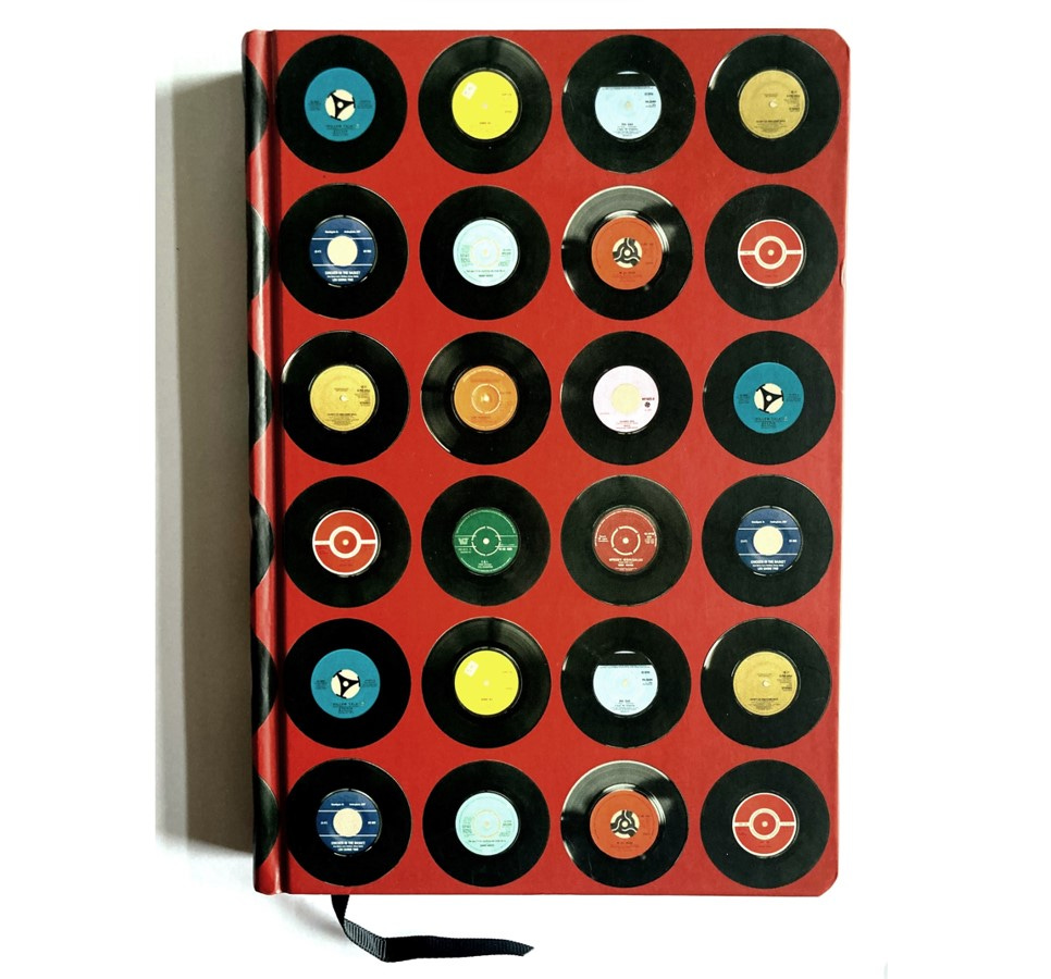
From the red notebook
I collect examples of record labels I want to remember in a notebook with this appropriate Ella Doran-designed cover.
The order of the examples follows what I find as I go through the notebook. First up is this masterpiece of simplicity, found on the two sides of Jim O’Rourke’s 2015 album Simple Songs.


I’m showing the whole discs here to emphasise the effect this label has as a continuum of the black space of the vinyl. This black-on-black aesthetic ensures that the only other marks on the label—the single and double dots that indicate sides 1 and 2—stand out as starkly beautiful information design. I also like the way that the double dots establish a line or path that moves in the direction of the centre hole. The space left in the path means that, were this to be expanded to a double album, there would be just enough space for four dots to be included before the hole.
During playback, as we can see in the video, the positioning of the dots on the edge of the label makes them appear like orbiting planets or suns.
I’ll return to the effects created by spinning labels below. First, another example from my notebook that uses celestial symbols in instructional ways. These labels are used on the ‘Morning’ and ‘Evening’ sides of Four Tet’s release Morning/Evening (2015). Other than the illustrations—which I believe are by Keiran Hebden’s partner and daughter—there is no information on the label itself. This means that a listener who might want to double check whether the sun equates to morning and the moon to evening needs to either look at the etchings in the ‘dead wax’ or ‘run out vinyl’—that part of the record around the label where information about the pressing plant and vinyl cutter can be found along with catalogue numbers—to check which side is which.


Next in the notebook is an entry on Lightning Bolt’s 2009 album Earthly Delights. This is a three-sided album where no information is provided on the labels other than the pictures of the skulls. The correct side is determined here by how many eyes or eye sockets each skull has. I suppose it’s more accurate to say that this is a four-sided record but that that the fourth side contains no music. It does contain an etching which, like the artwork on the sleeve and label, is by the band. Unlike some etched vinyl sides, there is a label attached, though it’s a blank yellowish green one, which, I suppose, is as communicative as the skulls in its indication of a lack of music.


By coincidence rather than design, the next entry in my notebook also has a skeletal theme. This is the 2014 European edition of the first Run the Jewels album on Big Dada Records (the album was released in the US in 2013 by Fool’s Gold). The design on the sleeve and the labels is a variation by Nicholas Gazin of his original design. Bony fingers count the four dies of the regular LP and its bonus 12-inch. No other information is given on the labels, meaning there’s work for the user to do to check what speed the 12-inch disc should play at (it’s 33 1/3).


I mentioned in my last post about the confusion caused by some label artwork that omits the speed the record is designed to play at. In the case of Aphex Twin’s 2015 EP Computer Controlled Acoustic Instruments Pt2, that confusion is manipulated by the instruction on the minimalist label to play at either 33 or 45. The only other marking on the labels is a single hyphen to indicate the A-side and a double hyphen to indicate the B-side. This starkness matches the design of the outer and inner sleeves, which are black with only very light, minimal text in the upper left corners. The artist name and EP title were only included on a hype sticker, not attached to all copies on sale (including the one I bought) and the digital download card inside.


The Aphex Twin album preceding the ‘Computer’ EP, 2014’s Syro, comes with a striking design from UK organisation The Designers Republic. Syro’s outer sleeve bears a typed list of all the costs involved in creating the album, including the costs for the artwork. I’m not including the label designs here, excellent though they are, as I want to show another TDR design that features in my notebook. This is for another classic of electronic music, the 1995 album Deep Space by Juan Atkins, released under the Model 500 name. For the labels of this double LP, TDR ditched the conventional numbering 1-4 or lettering A-D and opted instead for W-Z. The speed, meanwhile, is listed as ‘11.1 x 3 RPM’.


There’s a similar effect on the labels of Kano’s Made in the Manor. Although the A-D labelling is present, the labels are dominated by the K, A, N and O that replicate the design of Kano’s name from the album cover.


The order of the sides for Joanna Newsom’s album Divers is indicated by a small design at the top of each label showing a different stage of the moon’s phase from crescent (side A) to full (side D).


A turning world
All record label designers need to take account of the circular aspect of the disc, even when the vinyl is shaped in a non-circular form; any record, in order to play conventionally, needs to rotate around a central spindle. Some designs, such as the examples I showed in my last post from Disc, Folkways and Topic, show minimal or no concessions to circular style, opting instead for the same kind of blocklike information design that one would find on a square or rectangular label or form. Some take more creative options while still retaining straight lines, such as the octagonal-looking 1970s labels from Movieplay. (The labels are round, but look octagonal because the black edges merge into the wax).


Many designers, however, have embraced a purer curvature in the design of label text and also considered how the label will look as it spins. My closing examples from the red notebook all do one or both of these things.
First up are labels and inner sleeves from the album From Out Here by The Advisory Circle, a group that combines the music of Cate Brooks (credited on FOH as Jon Brooks) with the design concepts of Brooks, Jim Jupp and Julian House. Anyone who knows the work of the Ghost Box label is likely to be familiar with these names. Ghost Box is as much a visual as a sonic concern and the label’s releases are audiovisual projects that often make parodic and/or critically nostalgic reference to the aesthetics of a British postwar period covering roughly the 1950s to the 1970s.
I’m including the inner sleeve designs for From Out Here because of the way they place circular icons at the centre or near-centre of the sleeves. The telephone dial in particular looks to me like the kind of thing we might expect to find at the centre of the record. the labels, however, opt instead for what appear to be tape spools of some kind. Although not pressed quite to centre, they give a good sense of a tape or film spool going around while the record plays, thus conducting a neat cross-format trick.


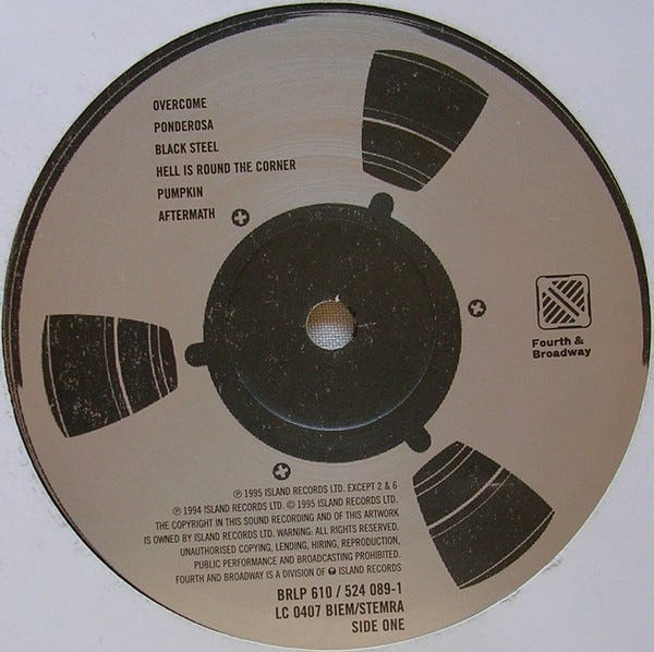
A similar design idea can be found on an earlier record, Tricky’s 1995 classic Maxinquaye. This design sets the text in stubbornly horizontal fashion across the label, but the spool design—retained in the Music for Vinyl reissue from the original Fourth & Broadway release—does the tape spool thing as well as any.
Lonnie Holley’s 2013 album Keeping a Record of It (Dust-to-Digital) also uses the spool or reel idea on the label. Much of the visual material on Holley’s records is his own artwork (though last year’s Me Oh My featured fellow artist Joe Minter) and the reel on Keeping a Record of It is no exception. The work shown on the label dates from 1984 and is titled Cutting Up Old Film (Don’t Edit the Wrong Thing Out). It can be seen on the Souls Grown Deep website, which is well worth checking out for art by Holley, Minter and many more. And it can be seen in rotation on the vinyl version of Keeping a Record of It.
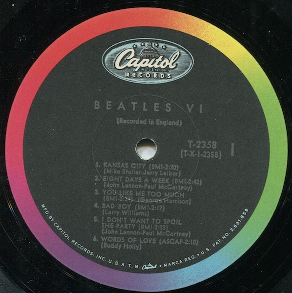
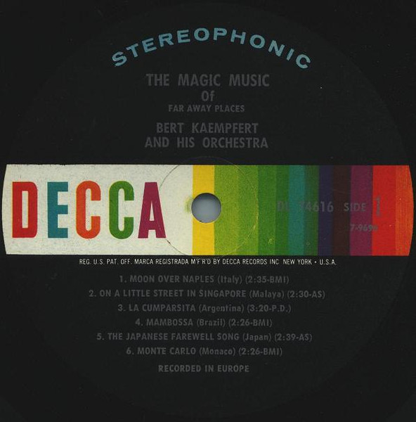
While on the subject of spools, this may be the point to make a transition to labels that create optical effects when spinning. This first one, from an imprint called Spectrum Spools set up in 2011 to promote new electronic music, is not all-immersive but does have a nice colour spectrum effect that recalls some of the classic stereo spectrum labels of the 1960s (I’m thinking of labels like Capitol and Decca, but there were others).
Having the spectrum as a circle allows for a smooth transition from one colour to another. While the zooming-in that I’ve done below is an unnatural perspective for a record listener, it hopefully gets across the possibilities of colour transitions arising from movement.
We’re moving inexorably to swirling pattern territory. The classic label here is the Vertigo swirl, as mentioned by Michael Fell in a comment on my last post. Having surprised myself by being unable to find a good example in my collection (my Black Sabbath albums are, disappointingly, either reissues on the NEMS label or Vertigo records after the label changed to the non-swirl design), I’m posting here an advert for the Vertigo swirl that I found at TV Tropes and someone else’s YouTube video of a Vertigo label in motion.


I think the labels to The Singles—a 2017 collection by Can released as a triple LP— provide a pretty good connecting point, both to the Vertigo black-and-white lines and the Ghost Box aesthetic (this is another design by GB’s Julian House). I like these labels on many levels, including the use of different designs for the CAN logo on each disc, the use of curved text, and the way that all tracks are printed on each disc but the relevant ones for that disc are in bold.


All the sides look good when playing, but my favourite would have to be Side E.
Finally, to bring things closer to (my) home, a couple of examples from Newcastle electro duo Warm Digits, whose albums often feature abstract spectrum designs on the covers and labels. The two videos below shows records from my collection spinning at different speeds. The first, at 33, is the 2017 album Wireless World on Memphis Industries. the second, at 45, is Keep Warm … with the Warm Digits, from 2011 on Distraction.
There are more examples to share from the red notebook and more label discoveries that I’m constantly making. I hope to do at least one more of these posts and to focus on some of the ways that labels have been designed to simulate examples from the past and also how labels have, at times, stood in for musicians themselves.
Another fascinating deep dive, thanks Richard. Highlighting the Vertigo label caused me to go back to look at one of my few 1971 albums from that label, the Ian Matthews release "If You Saw Thro' My Eyes" (itself an odd album title, grammatically). In at least that instance, the full Side A and Side B track listing is provided on the "B" side, and the "A" side consists of just the swirl label, with no other markings beyond the "A." I'm not sure I understand how I never noticed the swirl pattern before during playing the "A" side of the record -- it really is trippy and effective.
Ghostbox's Julian House is a fantastic graphic designer, holy hell.